Today I got a software feature change request:
The ‘Lock Ignition Timing’ checkbox should always be cleared when the window is closed. It sounds simple and the fix is simple. But I started to wondering why there is such a request.
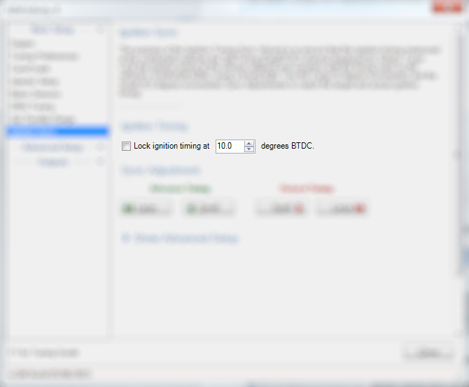
This is the interface of the window:

People use this window as a setup tool to perform a task. And that task requires the user to first ask the software to enter a mode first. Here is the usual action flow:
- Check the checkbox, telling the software to enter a mode.
- Customer do some stuff, this requires them leave the computer to check something else.
- Task is done.
- Uncheck the checkbox to tell the software to exit the mode.
- Close the window.
It turns out people sometimes forget step 4. I think, when they have done step 3, they are probably thinking “OK, it’s working, it’s done, now let’s close the tool.”
UX design tells us to focus on the task, and there is a reason: people use software tools to perform tasks. They are thinking in tasks.
In real world, this is like men rushing into the restroom and come out forgetting zipping the pants.
The same as software tools.
People use the software to perform a task or solve a problem, and while they are doing that, they think about the task, and forget about the interface.
A good UX design should user centered, and in this case, a good UX design will catch the user’s “mistake” and handle it gracefully.
The final solution is a really simple fix: the software will automatically uncheck the checkbox when the window is closed.
The lesson learned here is:
Don’t forget people forget.
